What are the Usability Principles?
25 years ago, Jakob Nielsen described the 10 general usability principles for interaction design. These principles were developed based on years of experience in the field of usability engineering and they’ve become rules of thumb for human-computer interaction.
Today, they are just as relevant as they were then. These usability principles can help to save development teams considerable amounts of time during early usability testing so that they can direct their attention to more complex design challenges. In addition, it’s also worth it to use them as a checklist when designing a new product or a feature.
Also, do not forget to check out Cleevio's latest design articles: 7 Tips For A Great UX Survey Result, Understand Your Customer Needs With The Kano Model.
Visibility of System Status
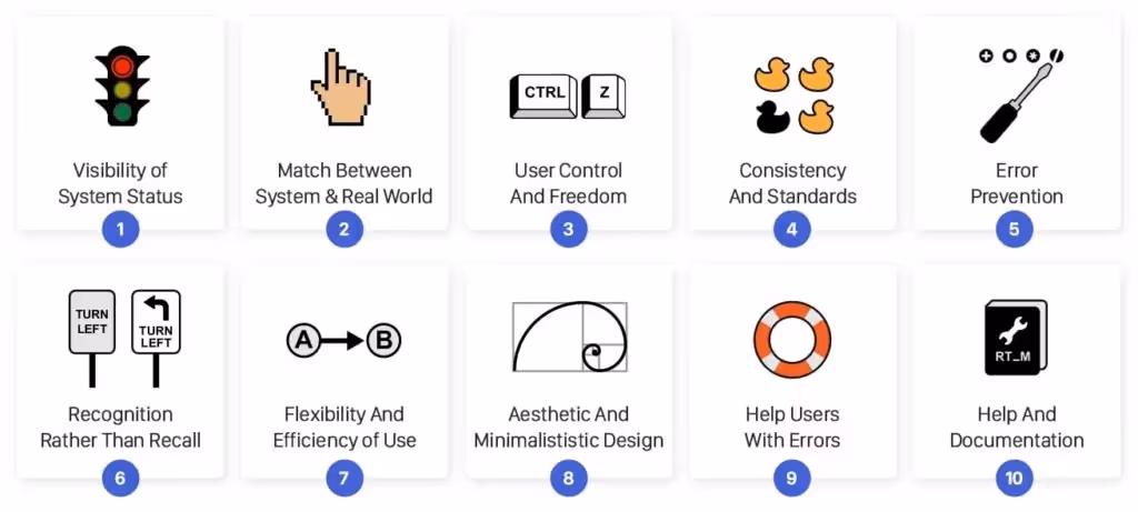
People love to keep things under control, and only then they can feel secure. From the evolutionary point of view, a need for safety and for physiological needs (like food, sleep, and sex) helped us to survive. The sense of control can be evoked by providing information about the system status and feedback after every interaction.
Take a look at your smartphone. Right after the screen lights up, it informs you about its battery, a wifi connection, received messages, missed calls, and much more. Imagine how insecure you would feel if this information were missing. By utilizing signs, icons, and indicators, the system communicates its status and helps user make better, more informed decisions.
When people interact with any system it should always provide immediate feedback on the interaction. Each of us have been burned by a bad experience in the past, which has left us sceptical and suspicious a priori. Just a visual sign like the change of the button’s colour, a loading spinner or an icon animation can help the user to understand what’s going on and prevent them from other unnecessary interactions.
The Match Between The System And The Real World
People are approaching every new system with a mental model in mind. In other words, people presume how the system could work based on their experience with other systems that are similar. By using language that they are familiar with, you can help users overcome the initial awkwardness.
An extreme example is a skeuomorphism design, which transfers all details of real world objects into the software. At the beginning of smartphone adoption, it helped people to learn how to use their new companions through the aesthetics and processes they were familiar with before.

Great examples of real-world matching icons
Even in today’s minimalistic world, dozens of design clues persisted from that era: apps like the compass or the calculator, or design components like folders, toggles, or lock icons. In addition, language and concepts from the real world help users to easily understand the system. That’s why the app for storing cards is called “Wallet,” we’re using “Bookmarks” for saving our favorite websites, we use the “Trash Can” to remove old files, or the “Shopping cart” while shopping online.
User Control And Freedom
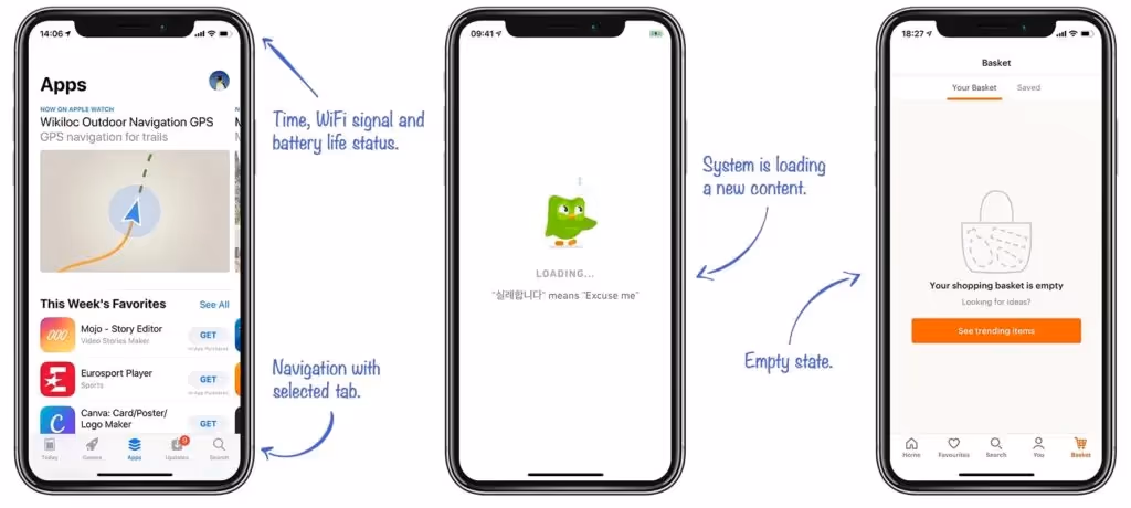
People often interact with the system in a hurry, and often times, they’re not even fully concentrated. This results in things like misclicks or other accidents which might be frustrating. Imagine a situation that involves something like accidental deletion of an important file or posting a grammatical mistake on your company’s social media; every system should have a clearly marked “emergency exit” mechanism, that provides users with an easy way back after they find themselves in an unwanted state.
“Every system should have a clear emergency exit.”
An appropriate emergency exit can be something as simple as an arrow back (e.g. in a browser), a trash bin, which protects us from accidental deletion, or the “undo” button, which lets the user to revert the last action. All of these examples demonstrate systems which don’t let users down when they make a mistake, and instead, they allow the user to fix it.
Consistency And Standards
Have you ever noticed that the copy-paste functionality works exactly the same, no matter what app you’re using? What about the fact that you can get on your home screen by simply swiping up from the bottom edge? These are just two usability patterns that Apple uses to make their system consistent and predictable for users. A comprehensible system should never confuse users by using different words, visuals, or actions for the same concepts.
“Don't forget that people spend 90% of their time interacting with other apps.”
A good starting point for a consistent design system of your mobile app are both Apple‘s Human Interface Guidelines and Google‘s Material Design Guidelines. They present a solid foundation that describes important design components with many examples. While designing your new app, never forget that people spend 90% of their time interacting with other apps, therefore using best practices and common patterns will eventually result in a much better overall experience. Consistency is one of the strongest contributors to usability.
Error Prevention
Based on Don Norman’s book The Design of Everyday Things, there are two kinds of errors created by interaction with a user interface: slips and mistakes.
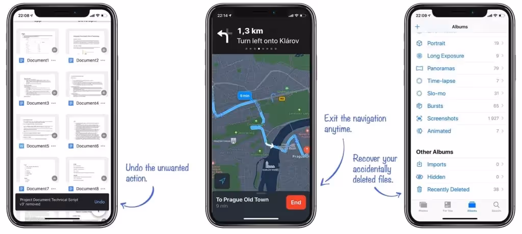
Slips happen when the user tends to do an action, but due to low attention, performs another one (e.g. when performing well known task). The strategy to prevent users from experiencing a slip is to minimize the chance of it occuring by guiding them only through the safe areas. Use constraints that don’t allow a user to set a wrong value (e.g. when you expect a number, don’t allow to write the letters), suggest the most common options to make choosing easy for users (e.g. while searching), or use confirmation dialogs before destructive actions.

Smart slip prevention in the Gmail web app. Unfortunately, the mobile app lacks this feature.
Mistakes are often caused by a user’s incorrect mental model of how the system works. In this case, the user misunderstands the communication and consciously performs an action which leads to a different result than they intended. These kind of errors don’t often come with an easy fix, and they should be revealed during the user testing phase. Use clear communication and a consistent design system to prevent mistakes.
Recognition Rather Than Recall
There are two types of memory retrieval: recognition and recall [5]. The recognition happens when you easily recognize a person or an object that you’re familiar with. It is a very shallow form of retrieval from memory and it doesn’t require any work. The recall happens when you have to find rarely used information in your memory (names, years, details, etc.). To recall information, people have to activate more memory chunks. Therefore, the recall process is a deeper retrieval and requires more work. (That’s why multiple-choice questions in tests are much easier to answer than open-answer questions.)
A good user interface doesn’t require the user to recall frequently. Instead, it offers all options and information required to make a choice. It’s much easier to quickly scan through icons or a text menu and select a coveted feature than trying to recall it from your memory and then write it into some terminal-like text interface. Give users clues for remembering information, and provide an icon next to the feature name or use a specific color for related functions. Well designed information architecture also helps with a hunt for information.
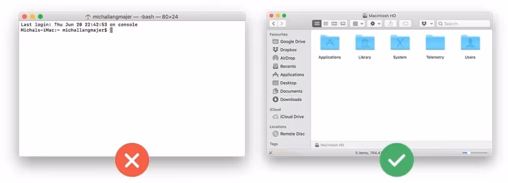
Users who are not familiar with the syntax of terminal commands can’t perform as easy operation as opening or deleting the file.
Flexibility And Efficiency of Use
Every user is unique; each have their own different needs and skills. Equally, every task is unique and requires different controllers.
Declutter the screen and make the app easier to navigate. The app should always display only relevant UI elements and commands. Look at apps like Apple Pages or G-Drive apps; when you’re writing a document, you see just a few controllers related to text editing. But when you decide to add an extra chart, a whole new palette of features specifically curated to help you complete this task appears.
Don’t forget about professionals and advanced users in general! A new user who is entering a learning curve [6] will always have different needs than the professional who’s using it a few hours every day. Power users might appreciate advanced options, shortcuts, or even extendability and customization of the app’s interface. Power users need to save their time and perform tasks quickly, but precisely and reliably too. A good user interface should offer appropriate functionality to both inexperienced and experienced users.
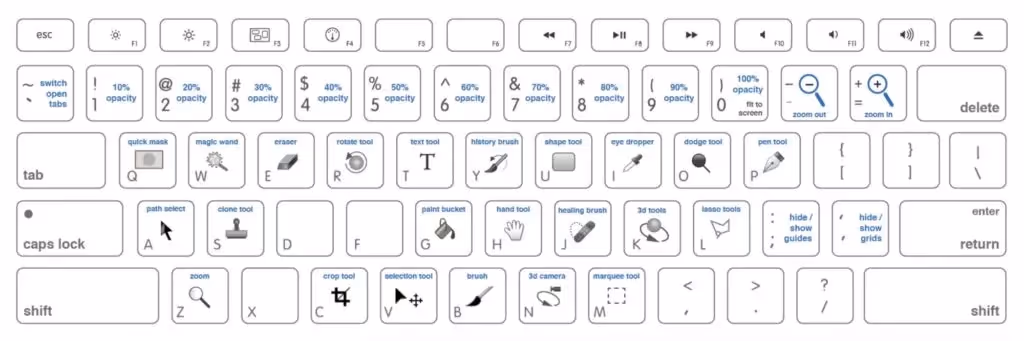
Advanced Photoshop Shortcuts [7]
Aesthetic And Minimalististic Design
Minimalism is not only a fashion of last few years, but it certainly is a lasting trend with the aim to reduce the description of a subject just to its necessary elements. It has many applications in art, music, and literature. Minimalism helps users to quickly access important information and come to the result quickly.
”Perfection is achieved, not when there is nothing more to add, but when there is nothing left to take away.” – Antoine de Saint-Exupery
To let the remaining content stand out, you can use nothing but whitespace. It helps to increase content legibility, it highlights call to actions, and creates a balanced and pleasant look [8]. A minimal design uses only the necessary colours to support the visual hierarchy. Think about the purpose and meaning of each color. Use it consistently.
Help Users Recognize, Diagnose, And Recover From Errors
Errors and issues of any kind can be frustrating for the user. Especially when they’re poorly designed and communicated. Whether we want it or not, users always tend to get themselves into situations that they need to find a way out of. To minimize the frustration, we should put as much effort into designing error experience as we put into the rest of the system.
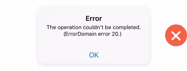
A bad example of the error message which is neither clear or useful for the user.
Every error message should be as explicit and precise as possible. Nobody wants to read vague messages like “something went wrong.” State what happened in a readable human language. Messages like “Class error 372,” are just as absurd. Give the user some constructive advice on what to do next. Propose the solution or direct the user to a customer support employee who can handle the situation. The last rule of good error messages is politeness. Never blame the user or imply that they’re stupid.
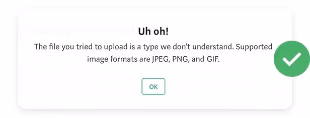
A great example of the error message which immediately suggests the next steps.
Help And Documentation
Every app should strive to be perfectly usable without any documentation, but as we mentioned before, every user has different skills and different levels of knowledge, and what is easy for 90% of your users might be difficult for the remaining 10%. Well written documentation, FAQs, and tutorials might be crucial for retaining the stunned user.
Documentation should be well structured, written in a human language, and minimalist. Sometimes, users don‘t need a whole lot of documentation; a simple coachmark showing how the new feature works or a brief onboarding guide that explains the basics is enough. Apps like Trello, Slack, and Duolingo are doing a great job at onboarding their users.
Conclusion
Here at Cleevio, we've designed over 120 digital products and those 10 usability principles have been used in the design of each of our products. Also, Cleevio has recently been announced a Winner of Mobile UX Awards. So if you are wondering about designing a new product, feel free to reach out to us as we are happy to offer you a free consultation.


.png)


.avif)

